Introduction
Embark on a journey into the world of interactive data visualization with D3.js, a powerful JavaScript library that enables data professionals and developers to craft intricate and responsive visualizations. This blog delves into the art and science of creating custom visuals with D3.js, illustrating how this tool can transform raw data into compelling, interactive, and insightful visual narratives.
Explore the significance of interactive data visualization in today’s data-centric world, where making data accessible and engaging is paramount. Understand how D3.js stands out in the realm of data visualization by offering unparalleled flexibility and control, allowing for the creation of visuals that are not only informative but also interactive and adaptable to user inputs.
The Essence of D3.js in Data Visualization
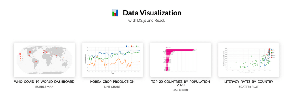
D3.js, standing for Data-Driven Documents, is a powerful JavaScript library that enables developers to bring data to life using HTML, SVG, and CSS. Its essence lies in its ability to allow for the dynamic and interactive visualization of data on the web, making it an invaluable tool for data scientists, statisticians, and web developers. D3.js’s unique approach to binding data to the DOM and applying data-driven transformations to the document enables the creation of sophisticated visualizations that can update dynamically with the data.
- Discover what makes D3.js a preferred choice for data visualization experts, highlighting its capabilities to bind data to the Document Object Model (DOM) and create dynamic visualizations that respond to user interactions.
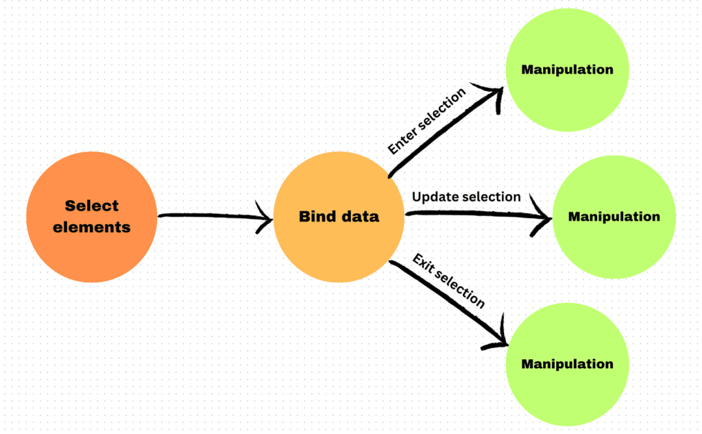
- Explore the foundational concepts of D3.js, including selections, data binding, and dynamic property setting, which empower developers to build complex visualizations from the ground up.
The true power of D3.js in data visualization comes from its flexibility and control. Unlike other visualization tools that offer pre-built charts, D3.js provides the building blocks for creating unique, bespoke visualizations tailored to specific data stories. This capability empowers developers to construct complex visual narratives that are interactive, responsive, and capable of conveying intricate data insights in an intuitive and engaging manner.
Setting the Stage: Your First Steps with D3.js
Embarking on your D3.js journey begins with understanding the basics of incorporating the library into your web projects. Setting up your environment to use D3.js involves linking to the library in your HTML file and understanding the structure of D3.js code. Creating your first visualization, such as a simple bar chart or scatter plot, introduces you to the fundamental concepts of scales, axes, and data binding in D3.js.
As you take your first steps with D3.js, you’ll learn to manipulate the DOM using data, creating graphical elements that reflect your dataset’s structure and content. This initial experience is crucial, as it lays the foundation for more complex visualizations, teaching you how to think in D3.js’s data-driven manner and how to translate data insights into compelling visual stories.
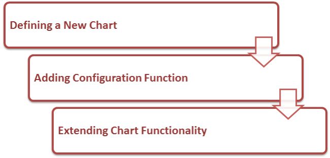
- Walk through the initial setup process for a D3.js project, detailing the essential steps to start transforming data into visual art.
- Create your first D3.js chart, a simple yet powerful introduction to the library’s potential to represent data visually.
Mastering D3.js: Core Techniques and Concepts
Mastering D3.js involves delving deeper into its core techniques and concepts, such as scales for mapping data values to visual dimensions, axes for adding context to your charts, and updates and transitions for creating dynamic, interactive visualizations. Understanding these concepts is essential for creating accurate and effective visual representations of data.
Beyond the basics, mastering D3.js means exploring its vast API to leverage more advanced features like complex shapes, layouts, and interactions. By gaining proficiency in these areas, developers can create sophisticated visualizations that not only display data but also invite users to explore and interact with the information, uncovering deeper insights and fostering a more engaging user experience.
- Delve into the core functionalities of D3.js, such as scales, axes, and shapes, which are crucial for crafting accurate and aesthetically pleasing visualizations.
- Understand the importance of scales in D3.js for mapping data points to visual elements, ensuring that your visuals accurately represent the underlying data.
Interactive Visualizations: Engaging Your Audience
- Learn how to add interactivity to your D3.js visualizations, allowing users to explore data through actions like clicking, hovering, and zooming.
- Discuss the impact of interactive elements on user engagement and data exploration, showcasing how D3.js enables the creation of visualizations that are not just seen but experienced.
Interactive visualizations are at the heart of D3.js’s appeal, offering users a way to engage with data beyond static charts. By incorporating interactivity, such as hover effects, zooming, and clicking, you can transform your visualizations into tools for exploration and discovery, allowing users to uncover the layers of data at their own pace.
This engagement is crucial for making complex data accessible and understandable to a broader audience. Interactive visualizations created with D3.js not only captivate users but also empower them to make personal discoveries and connections with the data, enhancing the overall impact and retention of the presented information.
Advanced D3.js: Beyond Basic Charts
Moving beyond basic charts with D3.js opens up a world of advanced data visualization possibilities. Developers can create complex, custom visualizations that are tailored to specific data sets and stories. This includes hierarchical diagrams, geospatial mappings, and even interactive network graphs, each offering unique ways to represent and explore data.
- Venture beyond basic charts to more complex and creative visualizations with D3.js, exploring how the library can be used to create custom visual elements and layouts.
- Examine the use of D3.js in creating sophisticated visualizations such as network diagrams, geographic maps, and interactive timelines, each offering unique insights and user experiences.
Advanced D3.js techniques involve leveraging more sophisticated aspects of the library, such as force layouts for network graphs or geo-projections for mapping. These advanced visualizations can reveal patterns and insights that are not apparent in simpler charts, providing a deeper understanding of the data and its implications.
Real-World Applications: D3.js in Action
In the real world, D3.js is employed across various industries and disciplines, from journalism and academia to finance and healthcare, to create impactful data visualizations. These real-world applications demonstrate the versatility and power of D3.js, showcasing how dynamic and interactive visualizations can aid in decision-making, storytelling, and data exploration.
For instance, news organizations use D3.js to create engaging and informative infographics that accompany articles, while researchers utilize it to visualize complex scientific data. Each application underscores the ability of D3.js to adapt to different contexts and data types, providing valuable insights and enhancing the user’s understanding of the information presented.
- Highlight case studies and examples where D3.js has been employed to solve real-world data visualization challenges, illustrating the library’s versatility across different domains.
- Discuss the strategic advantages of using D3.js for businesses and organizations, emphasizing how custom visualizations can lead to better decision-making and insights.
Navigating Challenges: Tips for Effective D3.js Visualizations
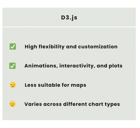
While D3.js is a potent tool for data visualization, developers may encounter challenges such as managing data complexity, ensuring browser compatibility, and optimizing performance. Overcoming these challenges involves adopting best practices such as modular code development, thorough testing across different environments, and staying updated with the latest D3.js versions and community insights.
- Address common hurdles faced by developers when working with D3.js, offering solutions and best practices to overcome these challenges.
- Emphasize the importance of performance optimization, accessibility, and cross-browser compatibility in creating effective D3.js visualizations.
Effective D3.js visualizations also require a balance between aesthetic design and functionality, ensuring that visualizations are not only visually appealing but also user-friendly and accessible. By addressing these challenges and adhering to best practices, developers can harness the full potential of D3.js to create visualizations that are both powerful and effective in conveying data-driven stories.
Interactive Data Visualization — The Art of Data Storytelling
Data visualization is no longer about displaying numbers — it’s about telling a story through data. The art of data storytelling combines design, analytics, and interactivity to transform raw data into meaningful narratives that resonate with audiences. In this context, interactive data visualization represents the next evolution of storytelling — allowing users to explore, manipulate, and derive insights from data dynamically.
Interactive visualizations encourage curiosity. Instead of passively observing static graphs, users can hover, zoom, filter, and click to uncover hidden patterns or relationships. This level of engagement transforms visualizations into data-driven experiences, where users play an active role in understanding the insights.
With tools like D3.js, developers can tailor the flow of a story based on user input, creating immersive dashboards, animations, and explorative interfaces. In journalism, for instance, interactive visualizations guide readers through complex socio-economic datasets. In business, they empower stakeholders to identify emerging trends and make real-time decisions. Ultimately, the art of interactive visualization lies in balancing clarity, creativity, and interactivity to communicate insights effectively while engaging the audience intellectually and emotionally.
Why Use D3.js for Data Visualization?
D3.js (Data-Driven Documents) stands as the gold standard for interactive web-based data visualization because of its unmatched flexibility, performance, and control. Unlike charting libraries that offer predefined templates, D3.js provides low-level control over every pixel, allowing developers to design completely custom visuals tailored to their data.
Here are key reasons why professionals choose D3.js:
- Data Binding Power
D3.js seamlessly binds data to DOM elements, enabling dynamic updates to visualizations as the data changes. This is ideal for live dashboards and real-time analytics. - Full Control and Flexibility
D3 doesn’t restrict you to preset chart types. Developers can create anything—from bar charts to radial trees, choropleth maps, or interactive network graphs—limited only by imagination. - Integration with Web Standards
Built entirely on HTML, SVG, and CSS, D3 visualizations integrate smoothly with modern web applications and remain highly customizable and scalable. - Performance Optimization
D3.js efficiently handles large datasets using features like canvas rendering and optimized DOM manipulation, ensuring smooth performance even for complex visuals. - Rich Interactivity and Animation
With built-in support for transitions, tooltips, zooming, and brushing, D3 empowers developers to create engaging, responsive, and animated user experiences. - Open Source and Community Driven
D3.js boasts a vibrant open-source community, extensive documentation, and countless plugins, making it easy to find examples, tutorials, and support. - Compatibility with Modern Data Tools
D3 integrates effortlessly with libraries and frameworks like React, Angular, Vue, and Plotly, allowing it to power modern analytics dashboards and storytelling platforms.
In essence, D3.js bridges the gap between design and data science, offering the creative freedom of art and the analytical rigor of statistics.
Properties of D3.js
D3.js comes with a unique set of properties that make it stand apart in the data visualization ecosystem. Understanding these properties is essential to fully leverage its capabilities:
- Declarative and Data-Driven
D3 emphasizes a declarative programming approach, meaning you describe what you want the visualization to look like, and D3 handles how to draw it. Its data-driven design ensures visuals are dynamically linked to the data source. - Scalable Vector Graphics (SVG) Based
D3 uses SVG to create crisp, resolution-independent graphics that render beautifully across devices, enabling zooming and scaling without quality loss. - Selections and Data Joins
Central to D3’s philosophy is the concept of selections—binding datasets to DOM elements. This enables seamless updates, additions, and removals as data changes. - Dynamic Transitions and Animations
D3 supports smooth transitions, allowing developers to animate data updates, filter changes, or layout transformations — enhancing storytelling and user engagement. - Hierarchical and Modular Architecture
D3 is modular, meaning you can import only the required components (e.g.,d3-scale,d3-axis,d3-shape), keeping your projects lightweight and efficient. - Integration with JSON, CSV, and APIs
D3 can consume data from diverse sources—JSON, CSV, REST APIs, or databases—making it versatile for real-world data applications. - Cross-Platform and Browser Compatibility
Built on standard web technologies, D3 works seamlessly across browsers and devices, from desktops to mobile interfaces. - High Customization Capability
From fonts and colors to geometries and motion, D3 provides granular control over every visual element, enabling truly bespoke data storytelling experiences. - Functional Programming Paradigm
D3 embraces functional programming concepts such as immutability and pure functions, promoting cleaner and more maintainable code. - Reusable and Extensible Components
Developers can create reusable visualization components or integrate D3 into existing systems, enabling scalability and collaborative development.
Conclusion
Reiterate the transformative power of D3.js in the field of data visualization, emphasizing its role in turning complex datasets into interactive, engaging, and insightful visual stories. Encourage readers to embrace D3.js, highlighting its potential to not only enhance data understanding but also to inspire innovation and creativity in data presentation.
FAQ’s
Is D3 JS good for data visualization?
Yes, D3.js is excellent for data visualization as it allows developers to create highly interactive, customizable, and dynamic visuals using web standards like HTML, SVG, and CSS.
What is interactive data visualization?
Interactive data visualization is a method of presenting data that allows users to explore, manipulate, and engage with visuals in real-time, such as filtering, zooming, or hovering to uncover insights dynamically.
What are the 5 C’s of data visualization?
Clarity – Ensure the visualization communicates the message clearly.
Consistency – Maintain uniform design and scales across visuals.
Context – Provide background or reference to interpret data correctly.
Comparison – Enable easy comparison between data points or groups.
Connection – Link the visualization to actionable insights or decisions.
What are the 7 steps of data visualization?
Define objectives – Understand the purpose and audience.
Collect data – Gather relevant and accurate data.
Clean and preprocess data – Handle missing values, outliers, and formatting.
Choose the right visualization – Select charts or graphs suitable for the data type.
Design the visualization – Focus on clarity, color, and layout.
Add context and annotations – Provide labels, titles, and explanations.
Review and refine – Test for accuracy, readability, and effectiveness.
What are the four types of data visualization?
Comparative – Shows differences or relationships between data points (e.g., bar charts, line charts).
Relational – Displays correlations or patterns between variables (e.g., scatter plots, bubble charts).
Hierarchical – Represents data with a structure or tree-like relationships (e.g., treemaps, dendrograms).
Temporal – Visualizes data over time to show trends or changes (e.g., time series charts, area charts).
