Data visualization plays a crucial role in understanding complex data by representing it in an easily digestible format. Whether it’s through graphs, charts, or maps, data visualization helps communicate patterns, trends, and insights effectively. But what are the types of data visualization, and how do they differ? In this article, we will explore the various types of data visualization, their applications, and an example of how they can be used effectively.
What is Data Visualization?
Data visualization is the graphical representation of information and data. By using visual elements like charts, graphs, and maps, data visualization tools provide an accessible way to see and understand trends, outliers, and patterns in data. It simplifies complex datasets and transforms them into visual stories that make decision-making easier.
Why is Data Visualization Important?
In the era of big data, understanding raw numbers can be overwhelming. Data visualization bridges the gap between raw data and meaningful insights by providing:
- Clarity: Visuals make it easier to understand complex datasets.
- Pattern Recognition: Trends and patterns are more noticeable in graphical form.
- Decision-Making: Visual insights help businesses make data-driven decisions.
- Communication: Visual storytelling enhances the presentation of findings.
Types of Data Visualization
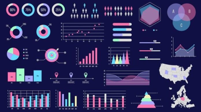
There are several types of data visualization, each suited to specific kinds of data and objectives. Here are the most commonly used types:
1. Charts
Charts are the most common form of data visualization. They simplify data comparison and highlight trends. Some popular types include:
- Bar Charts: Ideal for comparing categories. For example, sales performance across different regions.
- Line Charts: Used to show trends over time, like stock prices or website traffic.
- Pie Charts: Best for showing proportions within a whole, such as market share distribution.
- Area Charts: Similar to line charts but with shaded areas, useful for showing cumulative data trends.
2. Graphs
Graphs represent relationships between variables. They are particularly useful for statistical analysis.
- Scatter Plots: Display correlations between two variables, like advertising spend vs. sales revenue.
- Network Graphs: Used to show relationships between entities, such as social network connections.
- Bubble Graphs: Similar to scatter plots but with varying bubble sizes to represent additional data points.
3. Tables
Tables organize data into rows and columns, making it easy to look up specific information. While not as visually striking as charts, they are essential for detailed data presentation.
4. Maps
Maps are essential for geographic data visualization. They help in understanding location-based trends and patterns.
- Heat Maps: Show data density with color variations, like crime rates across neighborhoods.
- Choropleth Maps: Use color gradients to represent values across geographic regions, such as population density.
- Point Maps: Highlight specific locations, like store locations or event sites.
5. Infographics
Infographics combine text, images, and charts to present complex information in an engaging and easily understandable format. They are commonly used for storytelling and educational purposes.
6. Dashboards
Dashboards bring together multiple visualizations in one interface, providing a comprehensive view of key metrics. Business intelligence platforms like Tableau and Power BI often use dashboards to display real-time data insights.
What is an Example of Data Visualization?
To illustrate the power of data visualization, let’s consider an example from the healthcare sector.
Imagine a hospital tracking patient recovery rates across different departments. A line chart could show recovery trends over time, while a bar chart might compare recovery rates by department. A heat map could highlight areas within the hospital where patient outcomes are best. This multi-faceted approach allows administrators to identify strengths and areas for improvement quickly.
Choosing the Right Type of Data Visualization
Selecting the appropriate type of data visualization depends on the purpose of the analysis and the nature of the data. Here are some guidelines:
- Comparison: Use bar charts, column charts, or pie charts.
- Trends over time: Line charts and area charts work best.
- Distribution: Histograms and box plots reveal data distribution.
- Relationships: Scatter plots and bubble charts show correlations.
- Geographic data: Maps, including heat maps and choropleth maps, are ideal.
Tools for Creating Data Visualizations
Several tools are available for creating effective data visualizations, ranging from beginner-friendly platforms to advanced analytical tools:
- Excel: Great for basic charts and graphs.
- Tableau: Powerful for interactive dashboards and complex visualizations.
- Power BI: Ideal for business intelligence and real-time reporting.
- Google Data Studio: A free, user-friendly option for creating dashboards.
- Python and R: Preferred for advanced, customizable visualizations using libraries like Matplotlib, Seaborn, and ggplot2.
Best Practices for Effective Data Visualization
To ensure that your visualizations communicate insights effectively, follow these best practices:
- Know Your Audience: Tailor your visuals to the knowledge level of your audience.
- Simplify: Avoid clutter and focus on key insights.
- Use Appropriate Visuals: Match the visualization type to the data and objective.
- Ensure Accuracy: Avoid misleading visuals by maintaining scale and proportion.
- Highlight Key Insights: Use color, labels, and annotations to draw attention to important points.
Conclusion
Data visualization transforms complex datasets into clear, actionable insights. From simple bar charts to complex dashboards, the right visualization type depends on your data and communication goals. By understanding the different types of data visualization and their applications, you can unlock the full potential of your data.
Whether you’re analyzing business performance, tracking healthcare outcomes, or studying social trends, effective data visualization empowers better decision-making and enhances communication. With the right tools and best practices, you can turn raw data into compelling visual stories that drive success.
Would you like to learn more about how to create effective data visualizations or explore advanced tools like Tableau and Power BI? Let us know, and we’ll guide you through the process!


