In today’s data-driven world, the ability to effectively communicate complex information is paramount. Data visualization plays a pivotal role in transforming raw data into understandable insights. When done right, it has the power to simplify complex concepts, highlight trends, and facilitate better decision-making. This comprehensive guide delves into data visualization best practices for Creating Informative Graphics, equipping you with the skills to create informative graphics that captivate your audience.
Introduction To Informative Graphics
Data visualization is both an art and a science of creating Informative Graphics. It’s the art of representing data graphically to aid in understanding and analysis, and the science of choosing the right methods to convey that information effectively. Whether you are presenting sales figures, survey results, or complex scientific data, the goal remains the same: to convey information clearly and effectively. To achieve this, you need to follow data visualization best practices that are both scientifically grounded and aesthetically pleasing.
The Power of Data Visualization
Why is data visualization so powerful? Because it taps into the human brain’s innate ability to process visual information quickly and efficiently. Our brains are wired to interpret images and patterns, making data visualization an ideal tool for conveying complex ideas. When you present data visually, you make it easier for your audience to grasp, remember, and act upon.
Understanding Your Audience
Before diving into data visualization using Informative Graphics, it’s crucial to understand your target audience. Who will be viewing your graphics, and what is their level of expertise in the subject matter? Tailoring your visuals to your audience ensures that your message is received and understood.
For example, if you’re creating a data visualization for a group of financial analysts, you can assume a high level of data literacy. In such cases, you can use more advanced chart types and include detailed data points. On the other hand, if your audience is the general public, simplicity and clarity should be your guiding principles.
Choosing the Right Visualization Type

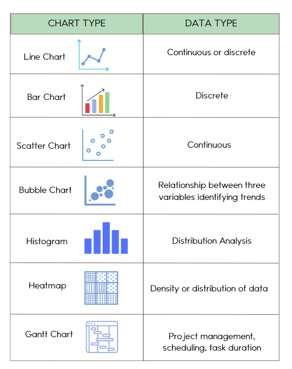
One of the fundamental principles of creating Informative Graphics, is choosing the appropriate chart or graph type for your data. Bar charts, line graphs, scatter plots, heatmaps, and more are at your disposal. Selecting the right visualization type depends on the data you have and the story you want to tell.
For example, if you want to show how a single data point changes over time, a line graph is a suitable choice. If you need to compare the performance of multiple categories, a bar chart can be more effective. Understanding the strengths and weaknesses of each chart type is essential for making the right choice.
Simplify and Declutter
Cluttered visuals can overwhelm and confuse your audience. Keep it simple and decluttered by removing unnecessary gridlines, data points, or decorations. Your audience should focus on the data, not distractions.
For instance, if you’re creating a dashboard to track website performance, consider removing excessive tick marks on your charts or unnecessary background images. A clean and uncluttered dashboard ensures that users can quickly glean insights without distractions.
Emphasize Key Insights
Highlighting the most critical insights in your data is essential. Use techniques such as color, size, or annotations to draw attention to key data points, trends, or outliers.
Imagine you’re presenting a sales report, and you want to emphasize a significant increase in revenue for a specific product line. You can use a contrasting color for that data series or add an annotation explaining the reason behind the spike.
Effective Use of Color
Color can be a powerful tool in Informative Graphics, but it should be used judiciously. Ensure that your color choices are meaningful, and avoid using too many colors in a single graph. Consistency in color coding is key for clarity.
For example, when visualizing data, using Informative Graphics, related to customer satisfaction, you can use a green color gradient to represent positive feedback and a red gradient for negative feedback. This consistent use of color helps users instantly understand the sentiment associated with each data point.
Labels and Annotations
Provide context to your visuals through clear labels and annotations. Axis labels, data point labels, and explanations help your audience understand what they are looking at and why it matters.
In a geographical data map, labeling major cities or regions can help users orient themselves. Adding annotations to specific data points can provide additional context, such as explaining a sudden drop in sales for a particular month.
Interactive Features
Incorporating interactivity into your data visualizations can enhance engagement and understanding. Tools like tooltips, zoom, or filters allow users to explore the data on their terms.
For instance, when creating an interactive dashboard for website analytics, users can hover over data points to see detailed information about traffic sources, page views, and conversion rates. This interactivity empowers users to dig deeper into the data and gain valuable insights.

Testing and Feedback
Before finalizing your Informative Graphics, test it with a sample audience or gather feedback from colleagues. This step helps identify any potential misunderstandings or areas for improvement.
For instance, if you’re designing a data visualization for a marketing campaign performance report, seek input from marketing professionals who can provide insights on the clarity and relevance of your visuals.
Real-World Examples
Let’s put these best practices into context with real-world examples:
Example 1: Sales Performance Dashboard
Imagine you’re tasked with creating a sales performance dashboard for a company’s quarterly review meeting. Your audience consists of sales executives, marketing teams, and financial analysts.
Best Practices Applied:
- Use a combination of bar charts and line graphs to show sales trends.
- Color code regions to identify high and low-performing areas.
- Provide interactive filters to drill down into specific product categories.
Example 2: COVID-19 Data Visualization
In the midst of a global pandemic, conveying accurate and up-to-date information is crucial. You’re tasked with creating a COVID-19 data visualization for a public health agency.
Best Practices Applied:
- Utilize a heatmap to show infection rates by region.
- Implement a time slider to track the progression of cases.
- Include clear labels and a legend for ease of understanding.
Conclusion
Data visualization is both an art and a science. By following these best practices, you can harness the power of visuals to convey your message effectively. Remember that practice makes perfect, and don’t hesitate to explore new tools and techniques to refine your data visualization skills for creating Informative Graphics. As you continue to create informative graphics, you’ll become a master at turning data into insights.
Explore the world of data visualization and unlock its potential for your business or projects. Start creating impactful graphics today!
For more in-depth insights into data visualization best practices and advanced techniques, check out our comprehensive guide.


