Introduction
Welcome to ‘8 Essential Principles of Dashboard Design: Crafting Effective Data Dashboards,’ a detailed exploration into the art and science of creating impactful data dashboards. This guide delves deep into the principles that make dashboards both visually appealing and functionally effective, balancing aesthetics with usability to communicate insights.
Understanding Dashboard Design
Dashboard design is a crucial aspect of data visualization, involving the creation of interfaces that display key information in an easily digestible format. It’s about presenting data intuitively and insightfully, providing a quick overview of key metrics and trends for informed decision-making.

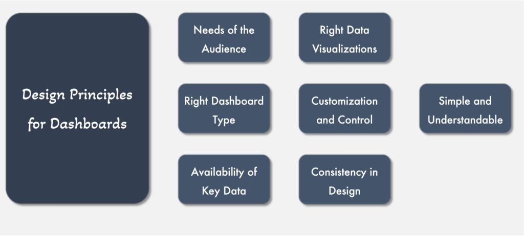
1. Simplicity and Clarity The best dashboards are characterized by their simplicity and clarity. They avoid clutter and focus on presenting only the most relevant data, making it easy for users to understand the information at a glance.
2. Visual Hierarchy Establishing a visual hierarchy is essential in guiding the viewer’s eye to the most critical information first. Design elements like size, color, and placement should be used strategically to emphasize key data points.
3. Consistency Consistency in design elements such as colors, fonts, and layout is crucial for creating a cohesive and intuitive dashboard. This consistency helps users to navigate the dashboard more easily and understand the data presented.
4. Interactivity Interactive elements like filters and drill-downs allow users to explore data in more depth and customize their view. This interactivity enhances user engagement and the overall utility of the dashboard.
5. Real-Time Data Incorporating real-time data ensures that the dashboard remains relevant and provides up-to-date information. This is particularly important in fast-paced environments where timely data is crucial for decision-making.
6. Accessibility Designing dashboards that are accessible to all users, including those with disabilities, is essential. This includes considerations like color contrast and providing alternative text for visual elements.
7. Responsive Design Ensuring that dashboards are responsive and function well on various devices and screen sizes is critical in today’s mobile-first world. A responsive design ensures that the dashboard is useful and accessible on any device.
8. User-centric design Designing with the end-user in mind is key. Understanding their needs, challenges, and how they will interact with the dashboard is crucial for creating an effective tool.
Advanced Techniques in Dashboard Design
Innovative Visualization Techniques: Embracing innovative visualization techniques is another advanced aspect of dashboard design. This involves using more sophisticated visual representations like heatmaps, treemaps, or advanced scatter plots to convey complex data relationships more effectively. These visualization methods can reveal patterns, trends, and correlations that might not be immediately apparent with traditional charts and graphs.

By incorporating these innovative techniques, dashboards can provide a more nuanced and comprehensive understanding of the data, allowing users to glean insights that would otherwise be difficult to extract. This approach is particularly useful in scenarios involving large datasets or when trying to understand multifaceted relationships within the data.
- Data Storytelling: Beyond just displaying data, dashboards should tell a story. This involves arranging data in a way that narrates a clear and compelling story, guiding the user through the information logically.
- Utilizing Advanced Analytics: Integrating advanced analytics into dashboards can provide deeper insights. Techniques like predictive analytics and data mining can be incorporated to enhance the dashboard’s utility.
Best Practices in Dashboard Layout and Structure
Logical Layout:
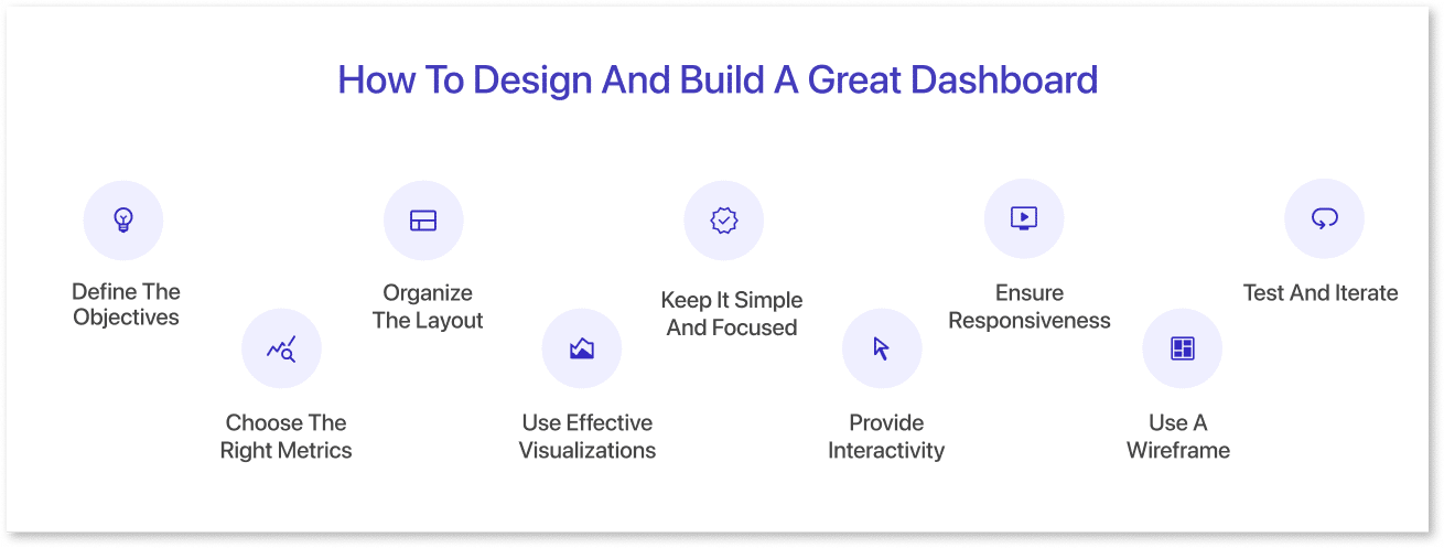
Organize the dashboard in a logical flow that aligns with the user’s thought process and decision-making workflow.
- User Journey Mapping: To achieve a logical layout, it’s essential to map out the user’s journey and understand how they interact with data. This involves identifying the key tasks users perform with the dashboard and arranging the information in a way that supports these tasks.
- For instance, placing high-priority data at the forefront and less critical information in subsequent sections can streamline the user’s decision-making process. This user-centric approach ensures that the dashboard layout mirrors the natural workflow of its users, making it more intuitive and effective in delivering the right information at the right time.
Segmentation:
Use segmentation to group related information, making it easier for users to process and analyze the data.
- Contextual Grouping: Effective segmentation goes beyond just grouping similar data; it involves organizing information in a contextually relevant manner. This means considering how different data sets relate to each other and how users will interpret this relationship.
- For example, in a sales dashboard, segmentation can involve grouping data related to customer demographics separately from financial performance metrics, yet ensuring these segments are interconnected for comprehensive analysis. This contextual grouping helps in creating a more coherent narrative within the dashboard, enabling users to draw insights across different but related data segments.
Incorporating User Feedback in Dashboard Design

Iterative Design Process:
Dashboard design should be an iterative process, incorporating user feedback to continuously improve and adapt the dashboard to changing needs.
User Testing:
Conducting user testing sessions can provide valuable insights into how users interact with the dashboard and what improvements are needed.
Engaging Stakeholders for Continuous Improvement:
In addition to user testing, actively engaging stakeholders throughout the dashboard design process is crucial for ensuring the final product meets the end-users’ needs. This engagement can take the form of regular feedback sessions, workshops, or surveys where users can express their opinions and suggestions for the dashboard.
By involving users in the development process, designers can gain a deeper understanding of the practical challenges and preferences that users encounter. This collaborative approach not only helps in tailoring the dashboard to specific user requirements but also fosters a sense of ownership and acceptance among the users, leading to higher adoption rates and more effective utilization of the dashboard in their daily workflows.
Conclusion
Effective dashboard design is a critical skill in the era of data-driven decision-making. By following these eight principles and incorporating advanced techniques and best practices, you can create dashboards that not only look good but also provide clear, actionable insights. As the field of data visualization evolves, staying updated with the latest trends and continuously refining your dashboards will be key to success.


Reviewed by 1 user
9 secrets that may improve your luck with the opposite sex
Nice post. I used to be checking continuously this weblog and I’m impressed! Extremely useful info specifically the last part 🙂 I handle such info a lot. I was looking for this certain information for a very long time. Thank you and best of luck.