Introduction
Welcome to our comprehensive guide on data visualization using Python, focusing on two of its most powerful libraries: Matplotlib and Seaborn. This blog will explore the capabilities of these tools in creating insightful and visually appealing data representations. From basic plots to advanced data visualization techniques, we’ll cover essential methods to enhance your data storytelling skills.
- Focus on Data Visualization with Python: Leveraging Matplotlib and Seaborn.
- Creating Compelling Visuals: Techniques for impactful data presentation.
Getting Started with Matplotlib
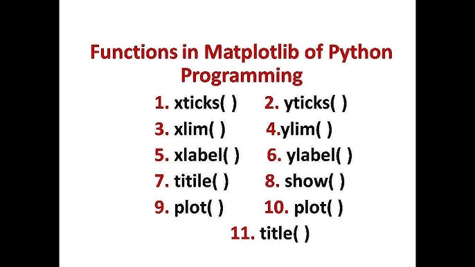
Matplotlib is a versatile Python library for creating static, animated, and interactive visualizations. We’ll begin by exploring basic plotting functions and how to customize graphs to suit your data storytelling needs.

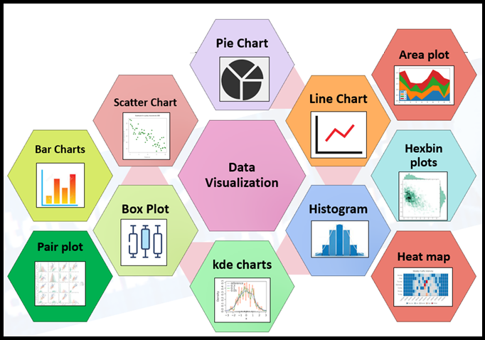
- Basic Plots: Line graphs, bar charts, and histograms.
- Customization Techniques: Colors, labels, and styles.
- Real-world Example: Visualizing sales data over time.
Matplotlib’s flexibility allows for customization at every step of the plotting process. Users can control aspects like figure size, aspect ratio, font properties, and grid lines, making it suitable for a wide range of applications. This level of control is particularly beneficial when preparing visuals for different mediums, be it a detailed report or a presentation. Furthermore, Matplotlib’s ability to work well with many operating systems and graphics backends makes it a universally accessible tool for data visualization.
Another significant advantage of Matplotlib is its compatibility with NumPy, a fundamental package for scientific computing in Python. This synergy enables the handling of large datasets and complex mathematical operations, which can be visualized effectively using Matplotlib’s plotting functions. This makes it an indispensable tool for data scientists who require both computational power and visualization capabilities.
Advanced Plotting with Matplotlib
Moving beyond the basics, we delve into the more complex plotting capabilities of Matplotlib. This includes multi-plot layouts, 3D graphs, and integrating with other Python libraries for enhanced functionality.

- Complex Graphs: Scatter plots, pie charts, and stack plots.
- Integrating with Pandas: Streamlining data frames visualization.
- Case Study: Market trend analysis using advanced plotting.
In advanced plotting, Matplotlib allows the creation of multi-faceted plots and figures, which are essential for comparing multiple data sets side by side. For instance, subplots can be used to create a single figure with several different views of the data. This is particularly useful in exploratory data analysis, where different aspects of the data need to be presented simultaneously for effective comparison and analysis.
Moreover, Matplotlib’s 3D plotting capabilities enable the visualization of three-dimensional data, which is crucial in fields like physics, chemistry, and biology. This feature allows for the creation of 3D scatter plots, wireframes, and surface plots, providing a deeper understanding of complex data structures and relationships that would be difficult to perceive in two dimensions.
Introduction to Seaborn for Statistical Data Visualization

Seaborn builds on Matplotlib and provides a high-level interface for drawing attractive and informative statistical graphics. We’ll cover how to use Seaborn for data distribution visualization and comparison.
Seaborn simplifies the process of creating complex statistical visualizations. It integrates seamlessly with Pandas DataFrames, making it an ideal choice for data scientists working with Python’s data manipulation tools. Seaborn’s ability to summarize and display data effectively makes it particularly useful for exploratory data analysis, where quick and insightful visuals are needed to understand data trends and patterns.
Additionally, Seaborn’s aesthetics are designed to be more modern and visually appealing than Matplotlib’s default settings. Its default color palettes are carefully chosen to be more harmonious and easier to perceive, enhancing the overall readability and presentation of graphs. This focus on aesthetic detail, combined with its statistical capabilities, makes Seaborn a powerful tool for data visualization.
- Data Distribution Plots: Box plots, violin plots, and KDE plots.
- Comparative Analysis: Facet grids and pair plots.
- Application: Analyzing customer behavior patterns.
Seaborn’s Advanced Visualization Features
Seaborn excels in creating complex visualizations with minimal code. We’ll explore its advanced features like heatmaps, cluster maps, and regression plots, which are invaluable for in-depth data analysis.

Seaborn’s heatmap is a powerful tool for visualizing complex matrices of data. It is particularly effective in displaying correlation matrices, which can help in identifying relationships between variables. The cluster map extends this functionality by adding hierarchical clustering, grouping similar data points, which is invaluable in fields like genomics and market segmentation.
Regression plots in Seaborn are not only visually appealing but also convey a wealth of statistical information. They can include confidence intervals and regression lines automatically, providing a clear view of the data trends and the robustness of the model. This feature is particularly useful in predictive analytics and for communicating statistical findings to a non-technical audience.
- Heatmaps and Cluster Maps: Visualizing correlation and clustering.
- Regression Plots: Linear and logistic regression visualization.
- Example: Heatmap in correlation analysis of financial indicators.
Combining Matplotlib and Seaborn for Comprehensive Data Storytelling
Finally, we’ll discuss how to combine Matplotlib and Seaborn to create comprehensive and detailed visualizations, leveraging the strengths of both libraries for effective data storytelling.
By combining Matplotlib and Seaborn, data professionals can leverage the strengths of both libraries. While Matplotlib provides the foundation and detailed customization options, Seaborn adds statistical functionality and modern aesthetics. This combination is particularly powerful when dealing with complex datasets that require both detailed customization and statistical depth.

- Integrating Matplotlib and Seaborn: Best practices and techniques.
- Dynamic Visualizations: Interactive plots for web applications.
- Real-world Use Case: Comprehensive dashboard creation for business intelligence.
The integration of these libraries also allows for greater flexibility in storytelling with data. Complex narratives can be constructed by layering plots, combining statistical graphs with annotated descriptions or highlights. This approach is crucial in fields like business intelligence and scientific research, where data-driven stories need to be compelling, accurate, and insightful.
Conclusion
Data visualization with Python, using Matplotlib and Seaborn, offers endless possibilities for transforming complex data into clear and engaging visuals. Whether you’re a beginner or an experienced data professional, mastering these libraries will significantly enhance your data analysis and presentation capabilities.
- The Power of Visual Storytelling: Elevating data analysis with visualization.
- Future Trends in Data Visualization: Emerging tools and techniques.
In conclusion, mastering data visualization with Python, particularly through Matplotlib and Seaborn, is a valuable skill for any data professional. These libraries offer a wide range of capabilities, from basic plots to advanced statistical visualizations, making them indispensable tools in the data science toolkit. As data becomes increasingly central to decision-making across industries, the ability to visualize and communicate data effectively will remain a key asset for professionals in the field.


